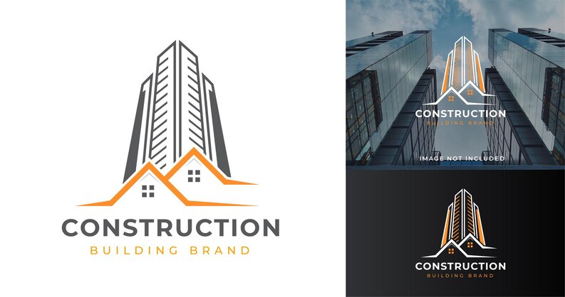
In today’s competitive business landscape, a well-designed logo serves as a crucial visual representation of a company’s brand identity. For construction businesses, an effective logo can convey professionalism, reliability, and strength while setting them apart from their competitors. Here, we delve into the Logo Design Dos and Don’ts for Construction Businesses.
Logo Design Dos and Don’ts for Construction Businesses
Dos:
Simplicity is Key:
A simple logo design is not only more memorable but also more versatile across various platforms. Aim for clean lines, clear shapes, and minimal intricate details. A straightforward logo will be easier to recognize in different sizes and in various mediums.
Reflect Your Business Identity:
Your logo should encapsulate the essence of your construction business. Think about the core values, services, and mission of your company. If your company specializes in modern, sustainable construction, your logo should reflect these aspects through its design elements.
Incorporate Relevant Icons:
Construction-related icons can effectively communicate the nature of your business. Tools like hammers, wrenches, buildings, cranes, and hard hats are recognizable symbols that can be used creatively in your logo to establish a visual connection with your industry.
Color Palette Choice:
Colors play a significant role in branding. For construction logos, earthy tones like browns, grays, and greens are often preferred. These colors resonate with the construction environment and evoke a sense of reliability and stability.
Typography Matters:
Choose a font style that complements your logo’s design. Bold, sturdy fonts can convey strength and reliability, while modern and sleek fonts might suit businesses focusing on contemporary designs. Make sure the font is legible even at smaller sizes.
Test in Black and White:
A strong logo design should be effective even in black and white. Before finalizing your logo, test its impact in grayscale to ensure that its core elements remain distinguishable without relying on color.
Don’ts:
Avoid Overcomplication:
While it’s tempting to include numerous design elements, an overly complex logo can be confusing and difficult to reproduce. A cluttered logo might lose its impact when scaled down or printed in smaller formats.
Steer Clear of Trends:
While incorporating current design trends might seem like a good idea, remember that your logo should have longevity. Trends can quickly become outdated, and you don’t want to redesign your logo frequently. Opt for a timeless design that will withstand the test of time.
Beware of Irrelevant Elements:
Avoid including elements that don’t directly relate to your construction business. Extraneous graphics can dilute the message and confuse the audience. Stick to icons and imagery that immediately evoke construction.
Don’t Overuse Color:
While colors are essential, using too many colors can be overwhelming and can dilute the impact of your logo. Limit your color palette to a few well-chosen hues that resonate with the construction industry.
Avoid Complex Typography:
Elaborate fonts with intricate details can make your logo difficult to read, especially when scaled down. Strive for a balance between uniqueness and legibility, ensuring that your company’s name is clear and easy to understand.
Say No to Clip Art:
Clip art or generic symbols can make your logo appear unprofessional and lack originality. Invest in custom design to create a logo that is unique to your construction business and conveys your brand’s personality accurately.
Also Read
Vetements Men’s Logo Print Hooded Sweatshirt
Conclusion
In conclusion, a well-designed logo can make a significant impact on how your construction business is perceived by clients and competitors. By adhering to these logo design dos and don’ts, you can craft a memorable and effective logo that resonates with your target audience and helps establish a strong brand identity in the construction industry. Remember, simplicity, relevance, and timelessness are key factors in creating a logo that stands the test of time. Therefore, before creating a logo for your business, it’s advisable to refer to a guide that provides construction logo ideas that will enhance your Company’s image.


